Gin
Background
A boutique Gin brand conceived to stand apart within a saturated market. The challenge was to craft a distinctive yet restrained identity on a transparent label-one that communicates both clarity and depth, while evoking a sense of escape.

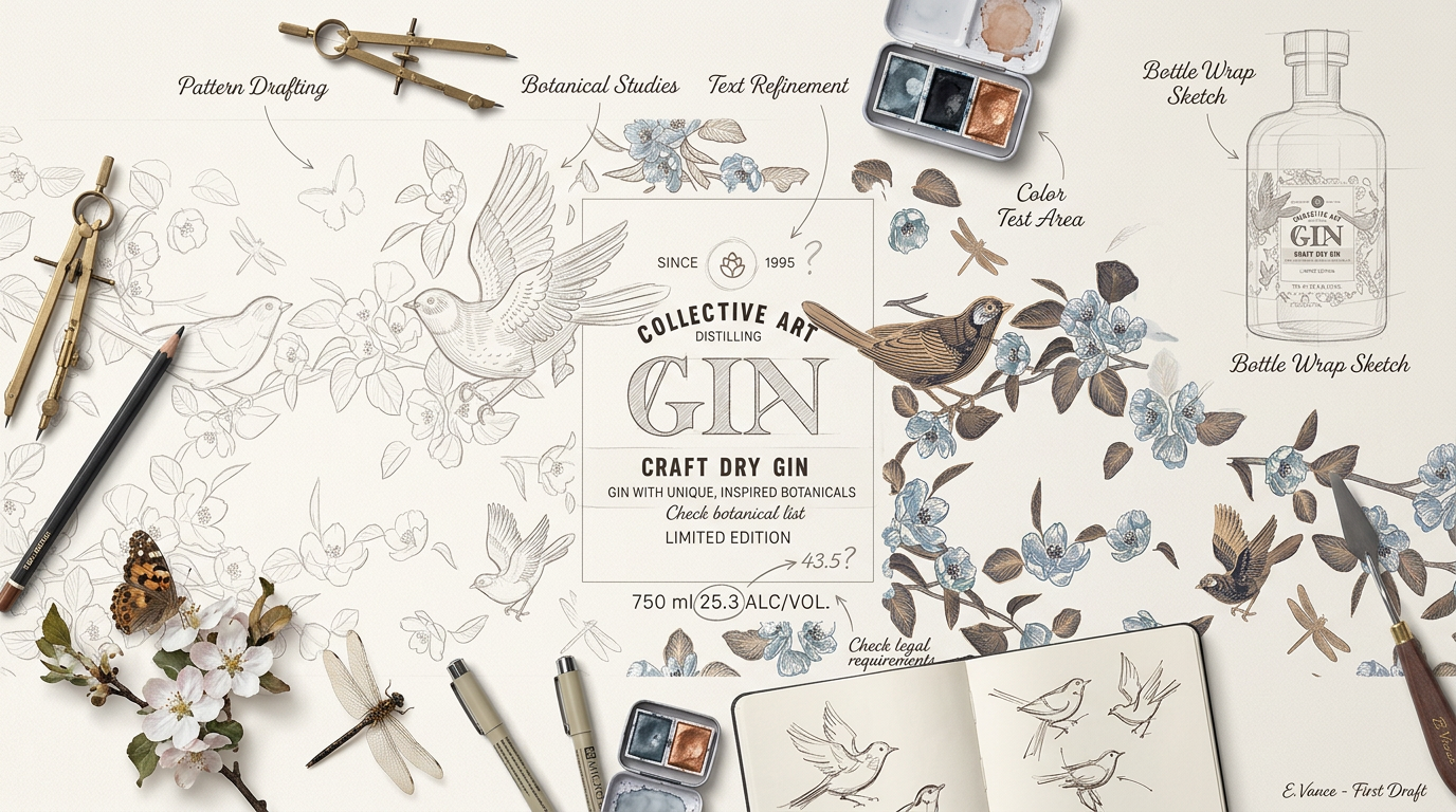
Process
The design explores the symbolism of birds as an expression of freedom, lightness, and quiet movement. Composed with precision, the visual elements interact with the transparency of the label, allowing the liquid to become an integral part of the composition. A refined, understated color palette supports the concept, elevating the design while maintaining balance and subtlety.
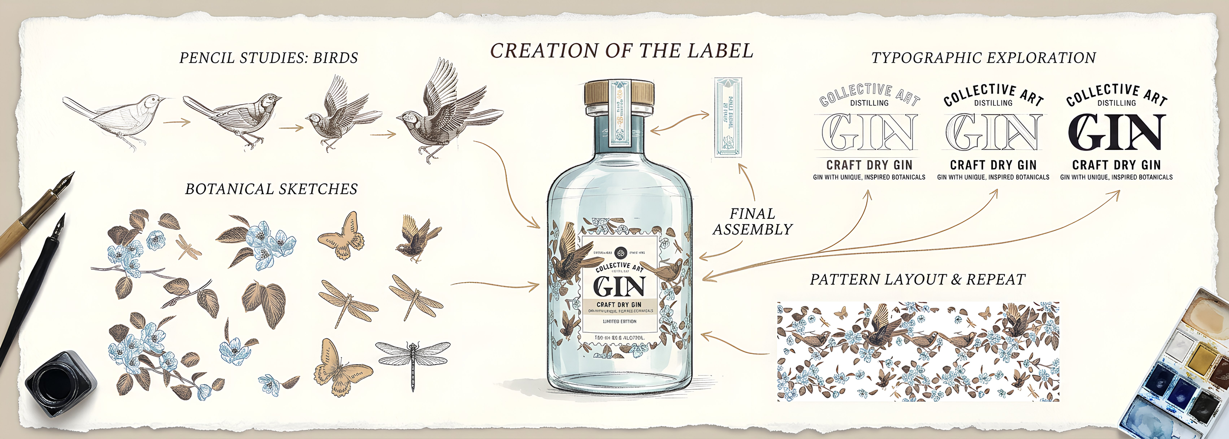
Outcome
The result is a sophisticated and memorable brand presence. The interplay between transparency, form, and motif creates a layered visual experience-one that feels both elevated and effortless, capturing a sense of freedom, pleasure, and considered design.